Initial sketches

These are the sketches that were created at the very beginning of the project and these helped with the initial ideas. Some of these ideas made it to the final stage of design and others were discarded. 


I considered having long narrow windows at an early stage.


First instance of the cladding channelling rainwater for collection


There was an idea for having the wind turbines under the building but this was abandoned because it wasn't a very efficient location for the turbines to to capture the wind. Also there were safety concerns. 


First instance for the slanted window seen in the final design and also the vertical cladding.


First instance of the addition of a balcony and spiral staircase entrance. A version of this made it to the final design

Initial exterior concepts

At the end of the project I thought it would be a good idea to reflect on the early concepts and ideas that began this project. From working at Urban 3D I found it more beneficial to start creating concepts directly with Cinema 4D and avoided 3d sketching. I feel this speeds up my workflow and allows me to view a newly created concept from all angles immediately.
At this stage scale was not taken into consideration, it was simply an exercise in shape and form. From these shapes my building began to take shape.


3d concepts


Photoshop post works

Post works is the last stage of production of a CGI. Once a render is complete this image file is opened within Adobe Photoshop. The aim of post works is to add the final details to the image. This can include simple colour correction and lighting adjustments to completely transforming an image.  

This is a series of images that show the before and after of the post works process. 


Interior: Kitchen

Inspiration for the kitchen scene


The kitchen area of the room that experienced the most change from beginning to end. I began with a composition that included all the the kitchen and partially the window and stairs. While testing i realised that this composition was not working, it was flat and uninteresting. The black table and lights were against the black kitchen unit, this would not have worked. Also the slanted window could be an attractive centre piece for this composition and it was barley being included. 


Below can be seen the new and final composition. Previously the kitchen would be a double spread A4 page but I changed this to a single A4 page potrait composition. Every other room was a double spread so this added some variety to the brochure. It also allowed me to include an 'interior introduction' page to the left of the CGI. This would allow the brochure to flow better. Throughout this process the rug was changed and the wood inlay of the kitchen was swapped out several times. 


Simple introduction page

Interior: Living


Series of development shots of the living area where changes in lighting and props can be seen throughout the process. Each room will have roughly 40+ hours of work.

Interior: Bedroom

The bedroom began with a series of bedroom images from interior design sites. These images made up a mood board which I could draw influence from, in therms of use of colour and props. 


Above are early floor plans that that acted has a rough layout of the rooms. This allowed me to place the camera where I thought would make the most compelling image. 


The floor plans were refined and the positions of the furniture were adjusted. From this point on I could begin modelling the room. This was the same procedure for each interior shot; following the floor plans that were previously created.  


Above is a series of screen shots of the development of the bedroom.  Once the props and textures have been placed in the scene the lighting process begins. This is a lengthy process as each adjustment of the light has to be rendered out to see what effect it had.
I wanted the light to cast soft shadows over the room and for the light to be cast on the bed. This highlights the main feature of the room drawing the viewers attention.
Throughout this process there can be texture and model changes. This can be dictated by how the light is acting in the room.


Meeting with Urban 3D and how it influenced the CGI's

A meeting was scheduled at Urban 3D on the 19/04/16. This meeting proved very beneficial and improved the quality of the CGI's dramatically. I took Garry Harkin, the project manager, through my brochure as it presently stood and he gave me specific feedback on each CGI. Changes were made over the next few weeks based on this feedback. These images demonstrate the changes that were made. 


Feedback 
-The turbines were not detailed enough, add more modelled detaill. This will catch a light and shadow better.
-The turbines looked un-textured, use a more varied set of textures. Make the turbines look more metallic. 


Feedback 
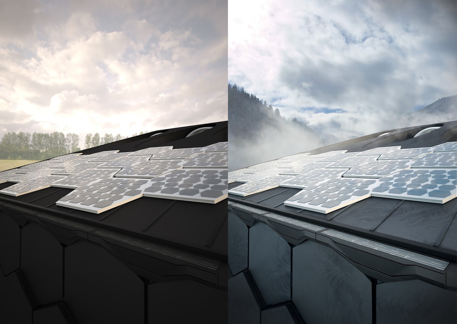
-This was the most problematic CGI in the brochure.
- It was unclear that this was a roof shot, it was confusing. So a new composition needed to be put in place.
-The texture of the solar panels was wrong and not photo-realistic. 
-The roof needed a cap around the edge, the edge of the roof is unrealistically built. Needs to be built out more.
-A custom designed gutter needs put in place to catch the water. 
-The frost texture needs to be placed in each individual panel. 


Feedback 
- Too much dark furniture. The black couch and media unit absorb too much light and a lot of detail in the model is lost.
-The media unit is too large and the white ornaments on the left should not be against a white wall.
-Add a floor lamp to the right side to add some more balance to the image. 
-The room needs a consistent use of colour. Add a colour cushion to the couch. 
-Texture the spot lights. 


Feedback 
- Thicken the boards the and part them slightly.
-Add more colour to the image, it's presently too monotone. 
-The scale of the lamp seems wrong.
-Change the floorboards. They are too thin and small at the moment. A luxurious room would have wide and long boards.
-Check if the hanging lamps are at an equal distance from the bed. 

New exterior design

I wasn't happy with the look of the previous exterior shots. It was too boxy and and didn't have that contemporary Scandinavian look. So I decided to re-do the design of the structure. I added a slant to the roof which led to a more dramatic profile and also gave me the opportunity to add wind turbines to the roof. From my research it was clear that mounting the turbines high was very important. 
The slant on the roof was then mimicked below the house to give a sense of consistent design. Also as large portion of the house is off the ground it will increase ventilation within the house. 


Brochure design- Front cover

The front cover of the brochure will be a very important element of the properties presentation. It will be the first image of the house a potential customer will see so it's important that it entices the viewer. I didn't want to simply show the entire house straight away as I wanted it to be revealed within the brochure, this insures the viewer is already reading the brochure. 
This is a more abstract angle of the house but it clearly shows the hexagon cladding and the wind turbines, two main features of the house.

Rough draft of the front cover, using a basic screen shot of the 3d model. This allowed me to quickly visualise the front cover without having to process a render.   

Although the black and white version gave a sense of sophistication and contemporary design the overall image seemed too ominous and oppressive. This may have worked for another project but it would not be appropriate for this house. This housing project should give a sense of clean living, freshness and natural beauty. The cloudy sky looked too sinister so that would have to be changed to either show less cloud or add some colour. 


Inspiration for the initial black and white front page design 

----------------------------------

Added colour


The purple and orange cover did not work either, the sky looked like it was full of smoke or smog, not appropriate for an environmentally friendly house. 


Final version

The vibrant blue sky add some much needed colour to the image. The clear blue sky also adds a sense of freshness and clean living. 
The tag line 'Green,contemporary, living' adds some extra information on what the brochure will contain and immediately communicates to the user the themes of this housing project. As the house is called 'Wind House' showing the turbines on the front cover would be appropriate.